728x90
반응형
Label을 이용하여 문자를 생성할 수 있다. 당연히 Label은 이미지 또는 도표, 그림 등도 넣을 수 있다.
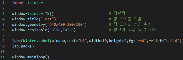
몇가지 파라메터를 넣어서 크기, 색, 테두리 등을 설정할 수 있다.
w = tk.Label(parent, option, ...)
아래 내용은 YUN DAE HEE 님의 블로그가 잘 정리되어 있으니 참고하기 바라며 TkDocs에 정보가 영문으로 있다.
| activebackground | Background color to be displayed when the mouse is over the widget. |
| activeforeground | Foreground color to be displayed when the mouse is over the widget. |
| anchor | This options controls where the text is positioned if the widget has more space than the text needs. The default is anchor=tk.CENTER, which centers the text in the available space. For other values, see Section 5.5, “Anchors”. For example, if you use anchor=tk.NW, the text would be positioned in the upper left-hand corner of the available space. |
| bg or background | The background color of the label area. See Section 5.3, “Colors”. |
| bitmap | Set this option equal to a bitmap or image object and the label will display that graphic. See Section 5.7, “Bitmaps” and Section 5.9, “Images”. |
| bd or borderwidth | Width of the border around the label; see Section 5.1, “Dimensions”. The default value is two pixels. |
| compound | If you would like the Label widget to display both text and a graphic (either a bitmap or an image), the compound option specifies the relative orientation of the graphic relative to the text. Values may be any of tk.LEFT, tk.RIGHT, tk.CENTER, tk.BOTTOM, or tk.TOP. For example, if you specify compound=BOTTOM, the graphic will be displayed below the text. |
| cursor | Cursor that appears when the mouse is over this label. See Section 5.8, “Cursors”. |
| disabledforeground | The foreground color to be displayed when the widget's state is tk.DISABLED. |
| font | If you are displaying text in this label (with the text or textvariable option, the font option specifies in what font that text will be displayed. See Section 5.4, “Type fonts”. |
| fg or foreground | If you are displaying text or a bitmap in this label, this option specifies the color of the text. If you are displaying a bitmap, this is the color that will appear at the position of the 1-bits in the bitmap. See Section 5.3, “Colors”. |
| height | Height of the label in lines (not pixels!). If this option is not set, the label will be sized to fit its contents. |
| highlightbackground | Color of the focus highlight when the widget does not have focus. |
| highlightcolor | The color of the focus highlight when the widget has focus. |
| highlightthickness | Thickness of the focus highlight. |
| image | To display a static image in the label widget, set this option to an image object. See Section 5.9, “Images”. |
| justify | Specifies how multiple lines of text will be aligned with respect to each other: tk.LEFT for flush left, tk.CENTER for centered (the default), or tk.RIGHT for right-justified. |
| padx | Extra space added to the left and right of the text within the widget. Default is 1. |
| pady | Extra space added above and below the text within the widget. Default is 1. |
| relief | Specifies the appearance of a decorative border around the label. The default is tk.FLAT; for other values, see Section 5.6, “Relief styles”. |
| state | By default, an Entry widget is in the tk.NORMAL state. Set this option to tk.DISABLED to make it unresponsive to mouse events. The state will be tk.ACTIVE when the mouse is over the widget. |
| takefocus | Normally, focus does not cycle through Label widgets; see Section 53, “Focus: routing keyboard input”. If you want this widget to be visited by the focus, set takefocus=1. |
| text | To display one or more lines of text in a label widget, set this option to a string containing the text. Internal newlines ('\n') will force a line break. |
| textvariable | To slave the text displayed in a label widget to a control variable of class StringVar, set this option to that variable. SeeSection 52, “Control variables: the values behind the widgets”. |
| underline | You can display an underline (_) below the nth letter of the text, counting from 0, by setting this option to n. The default is underline=-1, which means no underlining. |
| width | Width of the label in characters (not pixels!). If this option is not set, the label will be sized to fit its contents. |
| wraplength | You can limit the number of characters in each line by setting this option to the desired number. The default value, 0, means that lines will be broken only at newlines. |
<https://tkdocs.com/shipman/label.html>
Python tkinter 강좌 : 제 2강 - Label
Label(라벨)
076923.github.io
728x90
반응형
'프로그램 이야기 > 파이썬' 카테고리의 다른 글
| [Python-tkinter] 파이썬 window 창 만들기 (0) | 2021.12.01 |
|---|---|
| [Python] 파이썬의 파일 및 디렉토리 다루기 (0) | 2021.11.18 |
| [Python] 파이썬 파일 입출력 (0) | 2021.11.15 |
| [Python] 파이썬의 while 반복문 (0) | 2021.11.09 |
| [Python] 파이썬의 for 반복문 (0) | 2021.11.09 |